Bikeology
Role: UI Designer, UX Researcher
For: Springboard Capstone
Date: August 2020-September 2020
Type: Case Study
Overview: Bikeology is an online retailer that sells bikes on their mobile-web experience. The brand identifies itself as an expert in the field who is always in-the-know about the latest trends and best products when it comes to biking. Bikeology is savvy, focused, serious, and dependable.
Problem: Bikeology wants to increase revenue on the product’s mobile web experience. In order to achieve this, we are focusing on two main goals. The first goal is to tackle browsing to checkout conversion, we have learned that 50% of users open an average of 7 item pages only to abandon the site. This leads us to hypothesize that users are unable to determine which bike is best based on their relative features. As a solution to the first problem, we will create a product comparison feature. The second issue is that 70% of users who place an item in their cart do not complete the purchase. Currently, users must have an account or create one to complete a purchase. The product manager would like us to create a guest checkout as a solution for better conversion. The guest checkout will also capture email.
DESIGN ELEMENTS
USER BASE
• 24 - 38 years old
• User base is 72% men
• High-income earners
The main demographic for the brand is between the ages of 24-38 years old, mainly male (72% of base), high-income earning and they take biking very seriously. This means they are willing to spend a lot of money on their investment, but they are also very picky and research-driven.
PROCESS
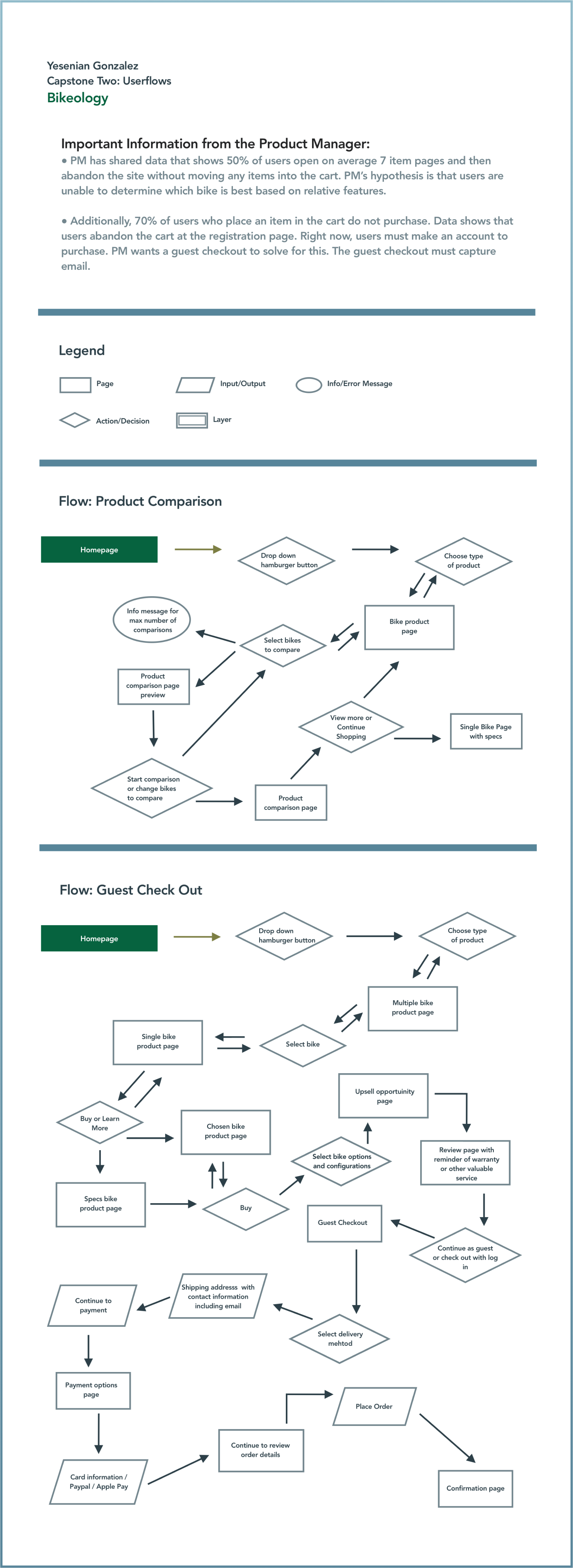
In order to begin the project, the first thing I did was review the information/data provided by the product manager to determine the scope of the project. Along with reviewing information regarding the brand. A mood board was created and after determining the two main goals for the website a user flow was created with two processes:
• Product Comparison
• Guest Checkout
Once the user flow was determined, work could begin on the low-fidelity designs, which were created on Illustrator for iPad. These designs were thoughtfully created with inspiration from industry leaders in the eCommerce field. Both designs were meant to be the easiest routes to complete a task as to not overwhelm or frustrate a user.
USER FLOW
LO-FIDELITY DESIGNS
RESEARCH TEST SCRIPT
In order to review the designs, a test script was created for the first round of testing. This test script was used to control the interviews and keep the testing consistent. The testing was conducted over a span of two days and produced valuable information to review and incorporate into the designs. Afterward, the designs were upgraded to high-fidelity, taking into account the feedback from participants.
HI-FIDELITY DESIGNS
SECOND RESEARCH TEST SCRIPT
Again, we created a second test script and reviewed the feedback for the updated designs. This time, however, the test was moved online to be conducted remotely. It was done via a survey on Typeform.
A great example of feedback was to add a product review section to the single product and product comparison feature. Additionally, a summary section before completion of checkout was added so that users don’t have to go back and start over the process when checking out.
Finally, after synthesizing the information from the last round of user testing the final design was completed.


